

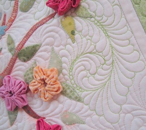
Some of you are probably like me… I love the look of contrast quilting, but sometimes, I am a little hesitant to use really contrasting colors on my quilting because contrasting quilting means easily spotted mistakes! I have in the past done some contrast quilting, as shown in the following from Out of the Nest:
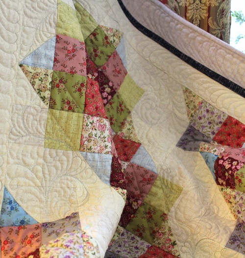
More often than not, my preferred color scheme is tone-on-tone quilting, as in Coxcombs and Berries.

BUT…. I have been experimenting with “subtle” contrast quilting in the last 6-9 months or so, and I am REALLY liking the look! The resulting look is such at the quilting is emphasized without being overpowering and taking over the overall look of a quilt.
Here you see a beige on white color scheme in Rising Stars:

And more recently in a couple of “yet to be official” quilts — variegated gray on beige, and light brown on beige.

My favorite Aurifil thread color remains 2310 – I wouldn’t know what I would do without my 2310 spools! But if you are wanting to try out how you like “subtle” contrasting quilting, may I suggest the following colors from Aurifil — 2843, , 2324, 5011, 2600, 4060, 2770, 2000, seen below on beige solid fabric.

I know we are already into April in this year. But perhaps it isn’t too late for you to try out some subtle contrast quilting?
I am eager for your feedback, and know I will love reading your comments on this post!
Thanks for stopping by. It’s back to work I go. Hugs to you all.

Absolutely drooling. Great thread talk post. I do so appreciate all your tips, tutorials and inspiration.
Just a hint, for possible future blog posts. I’d love to hear more of your thoughts on color selection. Maybe a mini show of your quilts and sharing insights on how you selected thread colors. This post, with all the different greys, certainly inspired me. I don’t think I’ve paid much attention to color selection for FMQ when I probably should have.
Absolutely gorgeous FMQ. Thanks for sharing.
SewCalGal
http://www.sewcalgal.blogspot.com
I agree with SewCalGal…lovin’ the possibilities that you touch upon here! I am inspired to try this subtle color approach to quilting!
The different shades create quite different looks. Very nice!
Well…. now that we have homework I better find a project to quilt! ;) Thanks for the fantastic info Wendy — I always love your quilting – so beautiful ! I just grabbed my stash of “neutrals” that I purchased at a LQS for the 12 Days of Christmas sale and I have many of the same as you show above (yippee!). For this muslin colored tone on tone fabric I’ve been using lately the Aurifil #2000 works perfectly. Can’t wait to try the others. Thanks again for sharing with us. Hugs, Karen
My mistakes are a lot easier to spot than yours!
what lovely quilting, have you done this on an ordinary sewing machine? it is immaculate and like the contrast as well as it being done in the same thread as the fabric both work well
Hi Margaret,
All the quilting you see on my quilts is done on my Bernina domestic sewing machine. :) Thanks for stopping by. Quilty hugs to you.
Wendy
I only discovered your blog last night and boy am I pleased to have found you. As a fairly new longarmer, I need all the help I can get and all your really helpfull advice, tips and wonderful photos that I can zoom into to see all the details are such a great help. I shall certainly try the Aurafil low contrast tip. Thank you for taking the time to share. Hug.
Your quilting as always is gorgeous. As a quilter who still can’t get “stitch in the ditch” straight, I am despairing of ever moving on. I have slight success with random, all over quilting, but wouldn’t dare do it with a contrast thread. I struggle to find good quality thread where I live. I will have to research online. How many spools do you go through when you quilt feathers on a bed size quilt?
I love the contrasting threads! thanks for sharing.
More great tips and beautiful quilting Wendy! I have tried varigated threads for quilting on prints and it turned out quite nicely, and a slightly darker varigated on beige… and yes you do see the mistakes… but I bet I make a lot more of them than you do! LOL but you know what? Unless they are drastic, I don’t stop to redo them. I am not perfect and neither should my quilts be. I feel that they are an extension of who I am. But let me tell ya, there have been a few times when I stop to look at what I’ve done and OOPS – like didn’t make sure the backing was smoothed away from the quilting area and got flipped under and I was quilting thru 3 layers of the backing. Yup, that was drastic. That also meant time for a break LOL. I really enjoy your posts Wendy, thank you for sharing!
Good morning Wendy…your quilting is gorgeous as usual. I really like the look of the contrasting threads. I’m not ready for it, but will keep the Aurifil in mind for sure. What weight is it?
Hi Marjorie,
The weight is 50wt. I find that weight to be perfect for domestic machine quilting. Happy Quilting. :)
WS
Good morning Wendy — I love this post. I do like the contrast thread. With your experience it will be beautiful. I have just started machine quilting my TShirt memorial quilt…in the ditch around all my blocks. I made a decision to use a varigated blue, and I am SORRY I did…because everyplace I “hopped” out of the ditch the darn thread was at a light spot. I bought a SPECIAL plate for my Janome Dual Feed foot which has a blade that runs along the seam line, and that has helped me stay in the ditch. But now, I have to put on my “big girl britches” and switch thread colors and start working around the actual t-shirts. Makes me a bit anxious, and will only do some modest stippling. I will get braver on my own projects, but since this is for some one else, I don’t dare risk it. Not sure how “picking out the bad stitches” would leave the tshirts. At least on ordinary quilting cotton it can get lost in the washing. :)
I agree with you. I love the subtlety of the stitching that is a different color but a softer contrast.
In your first picture, there is a pink tinge around some areas (the pale green leaf). Did you intentionally tint the area, or did a fabric or thread have its color run when it got wet? Just curious, not critical.
Love the contrasting thread and the feathers!
Beautiful work. I’m at the place in my quilting where a subtle tone on tone, or one step lighter is my adventure in contrasting.For me, the quilting should complement the piecing and not overwhelm it. It really depends on the quilt and what it can visually handle. Now that you have me thinking, I do see a dark modern quilt with high contrast quilting in my future though.
Have a great day.
Always, Queenie
I was wondering about the pink tinge to the fabric around the flowers. Did the fabric bleed? Your quilting is beautiful. The reason I ask about the pink tinge is because I recently had a fabric run and now I’m thinking about always washing the fabric first. Thanks, and again, your quilting is beautiful. I don’t want you to think i am criticizing.
I just love your Thread Talks!! I’ve used lots of variegated in the past (mostly King Tut), but have been using Glide and So Fine on the long-arm. If I’m quilting on my domestic, it’s usually Aurifil. The picture of all the Aurifil spools makes my heart go pitter-pat!! I use it exclusively for piecing…just love the way it behaves! One of my quilting “mentors” from my machine quilting bee always tells us “gold is the new neutral”…and it seems to always work out that way…especially like Glide’s “Sand” …it has a slight sheen and goes with everything!
Seems as though as I always try to blend the color of thread to my background. The subtle color is gorgeous. i may need to jump out of my box and give a gentle contrasting color a try. Thanks for the nudge.
I have been so scared about thread color. I have tried contrast and my mistakes stand out real fast. But I really like yours. You are doing it right. I had problems with bobbins too. I really like the idea of nudging contrast.
I’m willing to try contrast, even bold contrast and thank you for the boost of confidence.
Love your contrast thread quilting! Do not be afraid of going into the unknown. You are a talented quilter and can definitely do this. Thanks for the tips on colors. I really liked the grey and taupe threads on the light backgrounds.
ps…your Coxcombs and Berries is still my favorite quilt of yours! I am a huge pushover for traditional applique and you did a beautiful job on that one.
i luv the look, and will definitely be trying!
Just getting to this post and sorry I didn’t see it earlier! Your stitching is gorgeous as always and I love your concept of “subtle contrast”. I agree that it is scary to go bold with a contrast color but sometimes a little more definition than matched color provides is welcome.
I agree with you about the best Aurifil colors for it. I recently used #2324 to quilt a mini quilt that had peach, olive, blue, cream and lavender in it. Of all the other thread colors I auditioned (in various brands), it worked the best in subtly blending across the colors. Hope to try more of this in the future!